



s
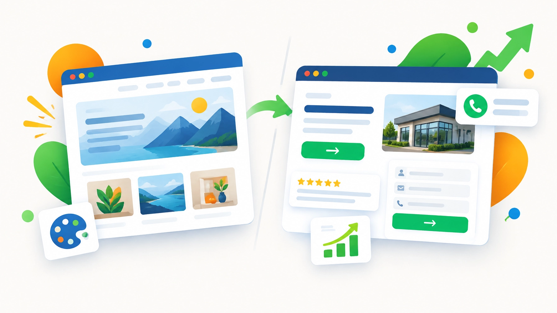
A professional-looking website is important. Your site is often the first place a potential customer learns about your business, so thoughtful design, appealing colors, and polished photography all matter.
However, visual appeal alone doesn't create leads. A website can look impressive and still make it difficult for visitors to call, request a quote, schedule an appointment, or make a purchase.
Your website needs to do more than look good. It needs to guide visitors toward a clear next step.
At SBO Buzz, we help small businesses build, manage, and improve websites that support real business goals. Use the five signs below to determine whether your website is designed to convert, or simply designed to look pretty.
1. Clarify What You Do Within a Few Seconds
When someone lands on your homepage, they should quickly understand three things:
- What your business offers
- Who you serve
- Why they should choose you
If your hero section features a clever slogan, a large background image, or vague wording such as “Experience the Difference,” visitors may still be unsure what you actually do.
A strong homepage headline should communicate your value in plain language. For example:
Affordable residential plumbing services for homeowners in Naperville.
This is much clearer than:
Creating Better Living Experiences.
Your homepage does not need to explain everything immediately. However, it should give visitors enough information to know they are in the right place.
Your supporting text can then explain your services, service area, experience, or competitive advantage. Keep the message direct and easy to scan.
Look for these warning signs:
- Your headline could describe almost any business
- Your service area is difficult to find
- Visitors need to scroll before learning what you offer
- Your main benefit is hidden in a long paragraph
- Your homepage focuses more on your company than on the customer’s needs
A clear message improves the customer experience and helps qualified visitors continue exploring your website. If your current homepage is confusing, our team can help you review the content, structure, and messaging through our website optimization services.
2. Make Your Main Call to Action Impossible to Miss
A conversion is any valuable action a visitor takes on your website. This might include calling your business, submitting a form, booking an appointment, downloading a guide, or requesting a quote.
If your website does not make the next step obvious, visitors may leave, even if they are interested in your service.
Your website should have one primary call to action (CTA) for each important page. A CTA tells visitors what to do next. Examples include:
- Request a Free Estimate
- Schedule a Consultation
- Call Our Office
- Book an Appointment
- Get a Custom Quote
- Start Your Project
“Learn More” is not always a strong CTA because it does not explain what happens next or why the visitor should click.
Place your primary CTA in several helpful locations:
- In the website header
- Near the top of the homepage
- After major service descriptions
- Beside testimonials or trust signals
- At the bottom of important pages
Your CTA should stand out without becoming distracting. Use a consistent button color, action-oriented wording, and enough spacing around the button so it is easy to find.
Additionally, avoid giving every button equal visual importance. If your homepage includes five competing actions, visitors may not know which one matters most.
A focused CTA does not limit your website. It gives visitors direction. We can help you identify the right conversion goal and organize your pages around it.
3. Test the Website on a Real Phone
A website may look excellent on a large desktop monitor and still provide a frustrating mobile experience.
Many customers search for local businesses from their phones. They may be standing in a driveway, sitting in a waiting room, or comparing service providers while traveling. If your website requires too much zooming, scrolling, or tapping, you may lose the lead before the customer contacts you.

Open your website on your phone and test the actions a potential customer would take. Check whether you can:
- Read the headline without zooming
- Tap the phone number easily
- Open the navigation menu
- Complete the contact form
- Find your address and business hours
- View service information without awkward scrolling
- Locate the primary CTA quickly
Pay special attention to forms. If a form asks for too much information, customers may abandon it. For an initial inquiry, you may only need a name, email address, phone number, and short message.
Mobile-friendly design is more than shrinking a desktop page. It means organizing content for smaller screens and making important actions easy to complete with a thumb.
As we mentioned earlier, good design should support business results. Our web design and development team can help you create a responsive website that looks professional and works smoothly across devices.
4. Improve Speed Before Adding More Visual Effects
Large images, video backgrounds, animations, third-party scripts, and unnecessary plugins can make a website look modern. They can also slow it down.
When pages take too long to load, visitors may leave before seeing your services or CTA. This is especially important for mobile users and people browsing on slower connections.
A visually rich website is only helpful when the page remains easy and fast to use.
Review these common performance problems:
- Oversized image files
- Uncompressed photographs
- Too many animations
- Unnecessary plugins
- Outdated website themes
- Excessive tracking scripts
- Embedded videos that load automatically
- Poorly optimized forms or booking tools

You do not necessarily need to remove every visual element. Instead, prioritize the ones that support your message and remove anything that creates distraction or delay.
A practical website performance review should focus first on your homepage, main service pages, and contact or booking page. These are usually the pages most connected to customer decisions.
Our team can review your website structure, images, content, and user experience to identify opportunities for improvement. Small technical adjustments can make the website easier to use, easier to manage, and more effective.
5. Add Trust Signals Where Customers Make Decisions
A customer may like your website and still hesitate to contact you if the business does not feel credible.
Trust signals reduce that hesitation. They give visitors evidence that your business is experienced, reliable, and worth contacting.
Useful trust signals include:
- Customer reviews
- Testimonials with names or business details
- Before-and-after photos
- Case studies
- Industry certifications
- Awards and recognition
- Service guarantees
- Clear contact information
- Photos of your team or location
- Links to active social media profiles
Trust signals should not be hidden on a separate testimonials page. Place them close to the actions you want visitors to take.
For instance, include a short testimonial beside your “Request a Quote” button. Add review highlights near your service descriptions. Display certifications near a contact form.
Your website should also look current. Broken links, outdated offers, missing images, and old business information can reduce confidence quickly. Even a beautiful design will not compensate for inaccurate details.
You can review your online reputation and website credibility together. Our digital marketing services can help connect website content, local SEO, reviews, and customer engagement into a more consistent online presence.
Turn a Pretty Website Into a More Effective Business Tool
Your website does not need to be complicated to convert visitors. It needs to be clear, useful, trustworthy, and easy to navigate.
Start with this short review:
- Can a visitor understand your business within a few seconds?
- Is your primary CTA visible and specific?
- Does the site work properly on a phone?
- Do important pages load quickly?
- Are reviews and trust signals displayed near key actions?
If you answered “no” to one or more questions, your website may not need a complete redesign. It may need focused optimization. In other cases, an outdated structure or poor mobile experience may make a new website the more affordable long-term solution.

At SBO Buzz, we can help with the full process: from website planning and design to content, SEO, conversion improvements, monitoring, and reporting. We work with small businesses that need professional support without the cost and complexity of a traditional large agency.
Request Your Free Website and Google Ads Review
Your website and advertising should work together. A well-designed landing page can improve the performance of paid campaigns, while accurate conversion tracking helps you understand which marketing activities generate results.
As part of our support for small businesses, SBO Buzz offers a 1-hour free Google Ads audit. During the audit, we can review:
- Campaign structure
- Conversion tracking
- Bidding and budget settings
- Landing page experience
- Wasted ad spend
- Campaign and conversion optimization issues
This review is a practical way to identify opportunities before you increase your advertising budget. You can also use the findings to improve the connection between your ads, landing pages, and website CTAs.
Contact SBO Buzz to request your free 1-hour Google Ads audit and learn how your website and campaigns can work more effectively together.
A good website should represent your business professionally, but it should also help customers take action. With affordable web design, ongoing optimization, local SEO, and practical marketing guidance, we can help you build an online presence that looks polished, works efficiently, and supports measurable growth.
